The EGC decides on the link between conceptual similarity and consumers’ confusion
The recent case the General Court of the European Union (the EGC) had to resolve was a great example of the correlation of conceptual similarity and public confusion. What conceptual similarity entails and how (not) to defend it, this case presents a systematic lesson for everyone.
Background of the case
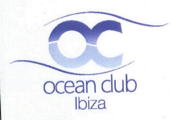
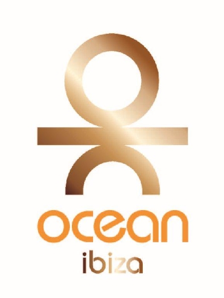
On 10 February 2012 Marbella Atlantic Ocean Club registered their logo in Spain. The sign in question was a blue figurative trademark (no. 3004401), protected for class 41 of the Nice Classification, for the offering of their entertainment services. Therefore, when the Office for Harmonization of Internal Market (OHIM, now EUIPO) registered a similar figurative trademark (CTMA no. 010610525) on 29 March 2012, they decided to oppose (case 002015835). The new application was filed by Ice Mountain Ibiza, in order to recieve protection for their film dubbing services. The Opposition Division ruled in favor of the earlier right (decision of 12 September 2013). They said that both services are intended to entertain customers and are very similar or identical. When comparing signs, the Opposition Division said the dominant word element of the sign can only be the word “ocean”, but is still weak both to the eyes and attention of the consumers and in comparison to the figurative element of the sign. Therefore, the signs are similar. Ice Mountain Ibiza appealed on 11 November 2013 (case R2207/2013-1). The Board of Appeal conducted a diligent analysis of the trademarks and their impact on consumers, and sided with the decision of the Opposition Division. The similarity of the services was not even questioned, everyone agreed they were similar. Ice Mountain Ibiza based the appeal on the figurative element of the sign, saying that the font and colors are different, but so is the perceived concept of the sign. They said that the older mark was a circle and a half-circle, obviously standing for the word “OC”. However, their figurative sign would be perceived as a stickman. The Board did not agree, deeming both signs would still present “OC” to the public and designating conceptual similarity to the trademarks. With all the mentioned similarities, consumers might be led to confusion. This was not the end of the case, as Ice Mountain appealed again, this time to the EGC.
Decision of the Court
The decision of the EGC (T-6/15), dated 25 May 2016, agreed with the previous decisions and repeated most of the Board’s reasoning. The first step the Court took was establishing the relevant public. They said it consisted of reasonably well-informed and reasonably attentive consumers. Next, it swiftly confirmed that the goods and services are similar or identical. More attention was given to the comparison of the mark itself. Visually, they looked rather similar. They do consist of the same letters, just rotated. Ice Mountain abandoned their stick figure theory and tried to argue that only figurative elements are dominant, and that the other words are insignificant, but the Court stated that even if that were true, the visual similarity still exists. The phonetic similarity was undisputed, so the applicant tried to shift the importance to visual (dis)similarity, saying that in that services sector it is more common to give weight to the visual. Thirdly, the court found it wrong to narrow the conceptual similarity just to the figurative element of the trademark, but even with that in mind, considers every part of the trademark conceptually similar. Finally, it was left to the Court to sum up and assess the likeliness of confusion. The Court decided it would be expected for the consumer to be confused, and that OHIM was right to reject Ice Mountain’s application.